Create a Shadcn UI Component Library with Tailwind v4 and Vite library mode
A comprehensive guide to create a custom component library using shadcn/ui, with detailed explanations for each step 5/16/2025If you’re a React developer, you’ve likely heard of shadcn/ui - a collection of beautifully designed, accessible components that you can copy and customize for your projects. In this guide, we’ll learn how to create our own component library using shadcn/ui and Tailwind v4, making it easy to share and reuse components across different projects.
You can see the code in github
What We’ll Build
We’ll create a component library that:
- Uses modern tools (Vite, Tailwind v4, TypeScript)
- Can be published to npm
- Includes shadcn/ui components
- Supports both ESM and CommonJS formats
- Has proper TypeScript support
- Includes CSS-in-JS for easy consumption
Prerequisites
Before we begin, make sure you have:
- Node.js installed (version 18 or higher recommended)
- Basic knowledge of React and TypeScript
- Familiarity with npm/pnpm package management
- A code editor (VS Code recommended)
Step 1: Project Setup
1.1 Create a New Project
First, let’s create a new project using Vite. We’ll use pnpm as our package manager, but you can use npm or yarn if you prefer.
# Create a new project with Vite
pnpm create vite@latest

◇  Project name:
│  ui-lib
│
◇  Select a framework:
│  React
│
◇  Select a variant:
│  TypeScript
│
◇  Scaffolding project in /Users/kuro/Development/ui-lib...
│
└  Done. Now run:

  cd ui-lib
  pnpm install
  pnpm run dev
1.2 Install Core Dependencies
Let’s install the essential dependencies we’ll need:
# Development dependencies
pnpm install -D tailwindcss @tailwindcss/vite jest @jest/globals @types/node
These packages are:
tailwindcss: The core Tailwind CSS framework@tailwindcss/vite: Vite plugin for Tailwindjestand@jest/globals: For testing our components@types/node: TypeScript definitions for Node.js
Step 2: Project Structure
2.1 Clean Up Default Files
We’ll start with a clean slate by removing the default files that Vite creates:
# Remove default files and directories
rm -rf public/ src/** index.html tsconfig.app.json tsconfig.node.json
2.2 Create Essential Directories and Files
Let’s create the basic structure for our library:
# Create necessary directories
mkdir src/lib types

# Create essential files
touch src/lib/main.ts src/style.css types/base.json types/react-library.json
This structure is important because:
src/lib/: Will contain our library’s entry point and utilitiestypes/: Contains TypeScript configuration filessrc/style.css: Will hold our global styles and Tailwind imports
2.3 Set Up TypeScript Configuration
We’ll create two TypeScript configuration files:
- First, create
types/base.jsonfor our base TypeScript settings:
{
  "$schema": "https://json.schemastore.org/tsconfig",
  "compilerOptions": {
    "composite": false,
    "declaration": true,        // Generates .d.ts files
    "declarationMap": true,     // Generates sourcemaps for .d.ts files
    "esModuleInterop": true,    // Enables cleaner imports
    "forceConsistentCasingInFileNames": true,
    "allowImportingTsExtensions": true,
    "inlineSources": false,
    "isolatedModules": true,
    "module": "ESNext",         // Uses modern JavaScript modules
    "moduleResolution": "Bundler",
    "noUnusedLocals": false,
    "noUnusedParameters": false,
    "preserveWatchOutput": true,
    "skipLibCheck": true,
    "strict": true,            // Enables strict type checking
    "noEmit": true,
    "strictNullChecks": true
  },
  "exclude": ["node_modules"]
}
- Then, create
types/react-library.jsonfor React-specific settings:
{
  "$schema": "https://json.schemastore.org/tsconfig",
  "extends": "./base.json",
  "compilerOptions": {
    "lib": ["ES2015"],         // Modern JavaScript features
    "module": "ESNext",        // Modern module system
    "target": "ES6",           // Modern JavaScript target
    "jsx": "react-jsx",        // React JSX support
    "noEmit": true
  }
}
- Finally, update the root
tsconfig.json:
{
  "extends": "./types/react-library.json",
  "compilerOptions": {
    "lib": ["dom", "ES2015"],  // Add DOM types for browser environment
    "sourceMap": true,         // Generate source maps
    "types": ["jest", "node"], // Include type definitions
    "baseUrl": ".",           // Base directory for imports
    "paths": {
      "@/*": ["./src/*"]      // Enable @ imports
    }
  },
  "include": ["src", "lib"],
  "exclude": ["dist", "build", "node_modules", "**/*.test.ts", "**/*.test.tsx"]
}
Step 3: Configure Vite
3.1 Install Vite Plugins
We need some additional Vite plugins to handle TypeScript declarations and CSS:
pnpm i -D vite-plugin-dts @vitejs/plugin-react vite-plugin-css-injected-by-js
These plugins are:
vite-plugin-dts: Generates TypeScript declaration files@vitejs/plugin-react: React support for Vitevite-plugin-css-injected-by-js: Injects CSS into JavaScript
3.2 Configure Vite
Create or update vite.config.ts:
import tailwindcss from '@tailwindcss/vite';
import { dirname, resolve } from 'node:path';
import { fileURLToPath } from 'node:url';
import { defineConfig } from 'vite';
import dts from 'vite-plugin-dts';
import react from '@vitejs/plugin-react';
import cssInjectedByJsPlugin from 'vite-plugin-css-injected-by-js';

const __dirname = dirname(fileURLToPath(import.meta.url));

export default defineConfig({
  plugins: [
    dts({ include: ['src/lib'] }),  // Generate .d.ts files
    react(),                         // Enable React
    tailwindcss(),                   // Enable Tailwind
    cssInjectedByJsPlugin()         // Inject CSS into JS
  ],
  build: {
    lib: {
      entry: resolve(__dirname, 'src/lib/main.ts'),  // Library entry point
      formats: ['es', 'cjs']                         // Output formats
    },
    rollupOptions: {
      // External dependencies that shouldn't be bundled
      external: ['react', 'react-dom', 'react/jsx-runtime'],
      output: {
        assetFileNames: 'assets/[name].[extname]',
        entryFileNames: '[name].[format].js'
      }
    }
  }
});
This configuration:
- Sets up our library entry point
- Configures output formats (ESM and CommonJS)
- Excludes React from the bundle
- Handles asset and file naming
Step 4: Add Shadcn/ui Support
4.1 Install Required Dependencies
pnpm add class-variance-authority clsx tailwind-merge lucide-react tw-animate-css
These packages are:
class-variance-authority: For managing component variantsclsxandtailwind-merge: For class name managementlucide-react: Icon librarytw-animate-css: Animation utilities
4.2 Set Up Styles
Update src/style.css with shadcn/ui’s base styles:
@import "tailwindcss";
@import "tw-animate-css";

/* Dark mode support */
@custom-variant dark (&:is(.dark *));

/* CSS Variables for theming */
:root {
  --background: oklch(1 0 0);
  --foreground: oklch(0.145 0 0);
  --card: oklch(1 0 0);
  --card-foreground: oklch(0.145 0 0);
  --popover: oklch(1 0 0);
  --popover-foreground: oklch(0.145 0 0);
  --primary: oklch(0.205 0 0);
  --primary-foreground: oklch(0.985 0 0);
  --secondary: oklch(0.97 0 0);
  --secondary-foreground: oklch(0.205 0 0);
  --muted: oklch(0.97 0 0);
  --muted-foreground: oklch(0.556 0 0);
  --accent: oklch(0.97 0 0);
  --accent-foreground: oklch(0.205 0 0);
  --destructive: oklch(0.577 0.245 27.325);
  --destructive-foreground: oklch(0.577 0.245 27.325);
  --border: oklch(0.922 0 0);
  --input: oklch(0.922 0 0);
  --ring: oklch(0.708 0 0);
  --chart-1: oklch(0.646 0.222 41.116);
  --chart-2: oklch(0.6 0.118 184.704);
  --chart-3: oklch(0.398 0.07 227.392);
  --chart-4: oklch(0.828 0.189 84.429);
  --chart-5: oklch(0.769 0.188 70.08);
  --radius: 0.625rem;
  --sidebar: oklch(0.985 0 0);
  --sidebar-foreground: oklch(0.145 0 0);
  --sidebar-primary: oklch(0.205 0 0);
  --sidebar-primary-foreground: oklch(0.985 0 0);
  --sidebar-accent: oklch(0.97 0 0);
  --sidebar-accent-foreground: oklch(0.205 0 0);
  --sidebar-border: oklch(0.922 0 0);
  --sidebar-ring: oklch(0.708 0 0);
}

/* Dark theme variables */
.dark {
  --background: oklch(0.145 0 0);
  --foreground: oklch(0.985 0 0);
  --card: oklch(0.145 0 0);
  --card-foreground: oklch(0.985 0 0);
  --popover: oklch(0.145 0 0);
  --popover-foreground: oklch(0.985 0 0);
  --primary: oklch(0.985 0 0);
  --primary-foreground: oklch(0.205 0 0);
  --secondary: oklch(0.269 0 0);
  --secondary-foreground: oklch(0.985 0 0);
  --muted: oklch(0.269 0 0);
  --muted-foreground: oklch(0.708 0 0);
  --accent: oklch(0.269 0 0);
  --accent-foreground: oklch(0.985 0 0);
  --destructive: oklch(0.396 0.141 25.723);
  --destructive-foreground: oklch(0.637 0.237 25.331);
  --border: oklch(0.269 0 0);
  --input: oklch(0.269 0 0);
  --ring: oklch(0.439 0 0);
  --chart-1: oklch(0.488 0.243 264.376);
  --chart-2: oklch(0.696 0.17 162.48);
  --chart-3: oklch(0.769 0.188 70.08);
  --chart-4: oklch(0.627 0.265 303.9);
  --chart-5: oklch(0.645 0.246 16.439);
  --sidebar: oklch(0.205 0 0);
  --sidebar-foreground: oklch(0.985 0 0);
  --sidebar-primary: oklch(0.488 0.243 264.376);
  --sidebar-primary-foreground: oklch(0.985 0 0);
  --sidebar-accent: oklch(0.269 0 0);
  --sidebar-accent-foreground: oklch(0.985 0 0);
  --sidebar-border: oklch(0.269 0 0);
  --sidebar-ring: oklch(0.439 0 0);
}

/* Theme configuration */
@theme inline {
  --color-background: var(--background);
  --color-foreground: var(--foreground);
  --color-card: var(--card);
  --color-card-foreground: var(--card-foreground);
  --color-popover: var(--popover);
  --color-popover-foreground: var(--popover-foreground);
  --color-primary: var(--primary);
  --color-primary-foreground: var(--primary-foreground);
  --color-secondary: var(--secondary);
  --color-secondary-foreground: var(--secondary-foreground);
  --color-muted: var(--muted);
  --color-muted-foreground: var(--muted-foreground);
  --color-accent: var(--accent);
  --color-accent-foreground: var(--accent-foreground);
  --color-destructive: var(--destructive);
  --color-destructive-foreground: var(--destructive-foreground);
  --color-border: var(--border);
  --color-input: var(--input);
  --color-ring: var(--ring);
  --color-chart-1: var(--chart-1);
  --color-chart-2: var(--chart-2);
  --color-chart-3: var(--chart-3);
  --color-chart-4: var(--chart-4);
  --color-chart-5: var(--chart-5);
  --radius-sm: calc(var(--radius) - 4px);
  --radius-md: calc(var(--radius) - 2px);
  --radius-lg: var(--radius);
  --radius-xl: calc(var(--radius) + 4px);
  --color-sidebar: var(--sidebar);
  --color-sidebar-foreground: var(--sidebar-foreground);
  --color-sidebar-primary: var(--sidebar-primary);
  --color-sidebar-primary-foreground: var(--sidebar-primary-foreground);
  --color-sidebar-accent: var(--sidebar-accent);
  --color-sidebar-accent-foreground: var(--sidebar-accent-foreground);
  --color-sidebar-border: var(--sidebar-border);
  --color-sidebar-ring: var(--sidebar-ring);
}

/* Base styles */
@layer base {
  * {
    @apply border-border outline-ring/50;
  }
  body {
    @apply bg-background text-foreground;
  }
}
4.3 Add Utility Functions
Create src/lib/utils.ts for our utility functions:
import { clsx, type ClassValue } from "clsx"
import { twMerge } from "tailwind-merge"

// Utility function to merge Tailwind classes
export function cn(...inputs: ClassValue[]) {
  return twMerge(clsx(inputs))
}
4.4 Configure Shadcn/ui
Create components.json in the root directory:
{
  "$schema": "https://ui.shadcn.com/schema.json",
  "style": "new-york",
  "rsc": false,
  "tsx": true,
  "tailwind": {
    "config": "",
    "css": "src/style.css",
    "baseColor": "zinc",
    "cssVariables": true,
    "prefix": ""
  },
  "aliases": {
    "components": "@/components",
    "utils": "@/lib/utils",
    "ui": "@/components",
    "lib": "@/lib",
    "hooks": "@/hooks"
  },
  "iconLibrary": "lucide"
}
Step 5: Add Your First Component
5.1 Add a Button Component
# Add the button component using shadcn CLI
pnpm dlx shadcn@latest add button
This will create a button component in src/components/button.tsx. Let’s move it to a better location:
# Create a dedicated button directory
mkdir -p src/button
mv src/components/button.tsx src/button/index.tsx
5.2 Export the Component
Update src/lib/main.ts to export our button:
//src/lib/main.ts
import '../style.css';
export { Button } from '../button';
Step 6: Configure Package.json
Update your package.json to include necessary fields for publishing:
{
  "name": "@your-package-name/ui",
  "version": "0.0.1",
  "sideEffects": false,
  "files": [
    "dist/**",
    "dist"
  ],
  "main": "dist/main.es.js",        // CommonJS entry point
  "module": "dist/main.es.js",      // ESM entry point
  "types": "dist/lib/main.d.ts",    // TypeScript declarations
  "scripts": {
    "build": "vite build",
    "dev": "vite --host 0.0.0.0 --port 3003 --clearScreen false",
    "check-types": "tsc --noEmit",
    "lint": "eslint src/",
    "test": "jest"
  },
  "jest": {
    "preset": "@backlogg/jest-presets/browser"
  },
  ...
}
Everything is ready, you should be able to compile your library.
Step 7: Build and Test
7.1 Build the Library
❯ pnpm build

> ui-lib@0.0.0 build /Users/kuro/Development/ui-lib
> vite build

vite v6.3.5 building for production...
✓ 9 modules transformed.

[vite:dts] Start generate declaration files...
dist/main.es.js  92.91 kB │ gzip: 17.93 kB
[vite:dts] Declaration files built in 576ms.

dist/main.cjs.js  44.05 kB │ gzip: 13.07 kB
✓ built in 750ms
This will create:
dist/main.es.js: ESM versiondist/main.cjs.js: CommonJS versiondist/lib/main.d.ts: TypeScript declarations
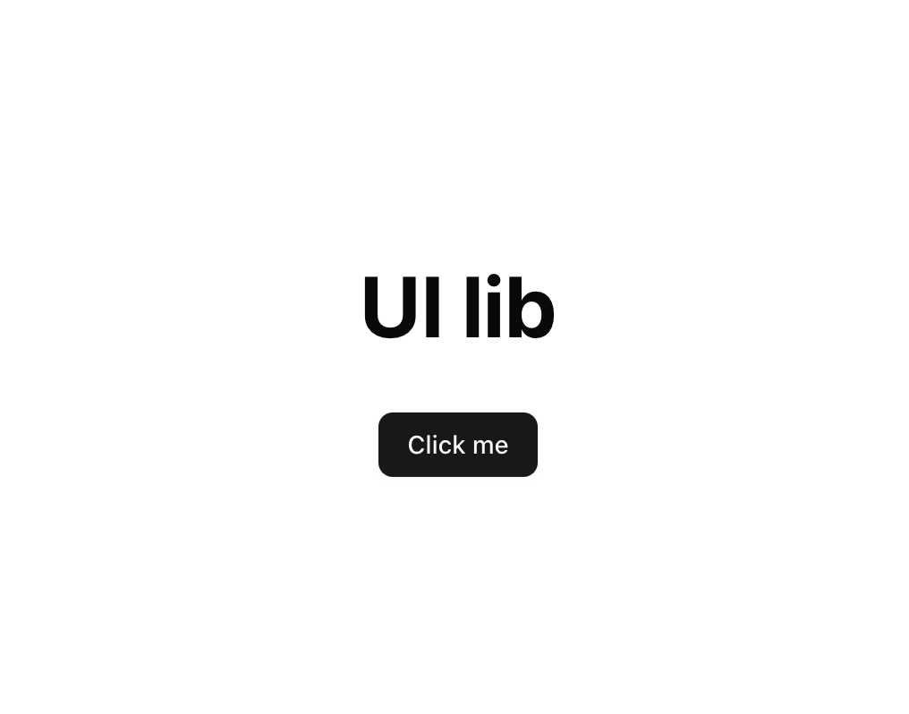
7.2 Using the Library
You can now use your library in other projects:
import { Button } from '@your-package-name/ui';
import './styles.css';

function App() {
  return (
    <div className='container'>
      <h1 className='title'>
        UI lib
      </h1>
      <Button>Click me</Button>
    </div>
  );
}
Next Steps
Now that you have a basic component library set up, you can:
- Add more components using
shadcn/ui - Write tests for your components
- Add documentation
- Publish to npm
- Add more features like:
- Storybook for component documentation
- More complex components
- Custom themes
- Additional utilities
Common Issues and Solutions
- CSS not loading: Make sure you’re importing the CSS file in your consuming project
- TypeScript errors: Check that all dependencies are properly installed and types are generated
- Build errors: Verify that all external dependencies are listed in
vite.config.ts